
Treasure Valley Community College: Ready to Fly
Client: Treasure Valley Community College (TVCC)
Scope: Full institutional rebrand + athletics identity rebrand
Completed: 2026


Collaborators
Strategy Lead: Emily Fisk
Creative Director: Shailey Katsilometes
Strategist and Copywriter: Haley Robinson
Graphic Designer: Lili Serio
Illustrator: Jessi Miracle
Outcome snapshot:
Fresh but connected institutional identity for a 62-year-old community college
Bold, ownable mascot and brand for a beloved athletics tradition
Community-validated brand direction
Clear internal rollout and adoption plan
The Challenge: Reintroducing a Familiar Community Pillar
Since opening its doors in 1962 with just a handful of classes at Ontario High School, Treasure Valley Community College has grown into a vibrant, diverse, and welcoming institution that serves more than 5,000 students each year. Nestled on 90 acres in the heart of rural Ontario, Oregon—with additional locations across Eastern Oregon and Western Idaho—TVCC combines the personalized support of a community college with the energy and opportunity of a traditional college experience.
A Beloved Mascot, But Inconsistent Brand
Over the past 15 years, TVCC has significantly invested in its campus facilities and in growing high-demand programs to meet the needs of a rapidly changing workforce. For the TVCC administrative team, there was a growing contrast between the maturation of the college’s programs, facilities, and strategic planning and its existing brand identity.
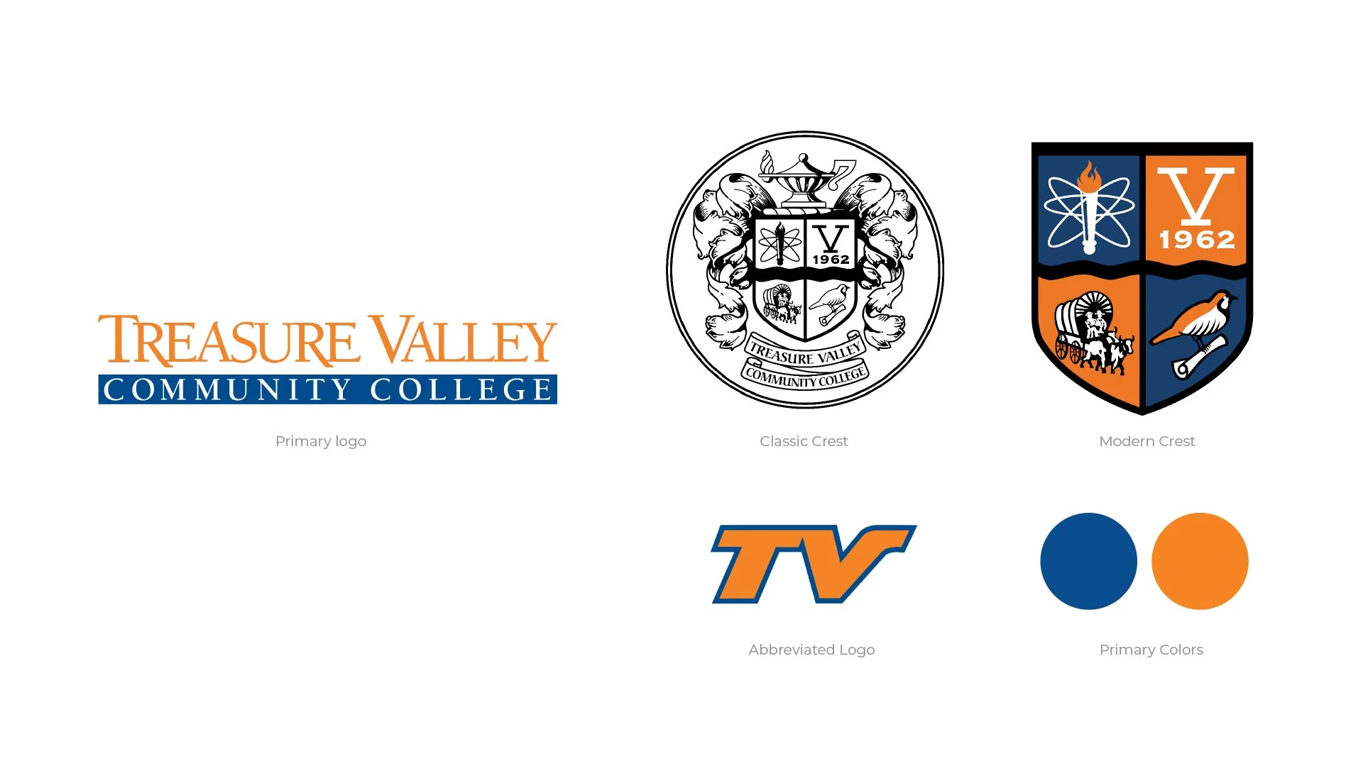
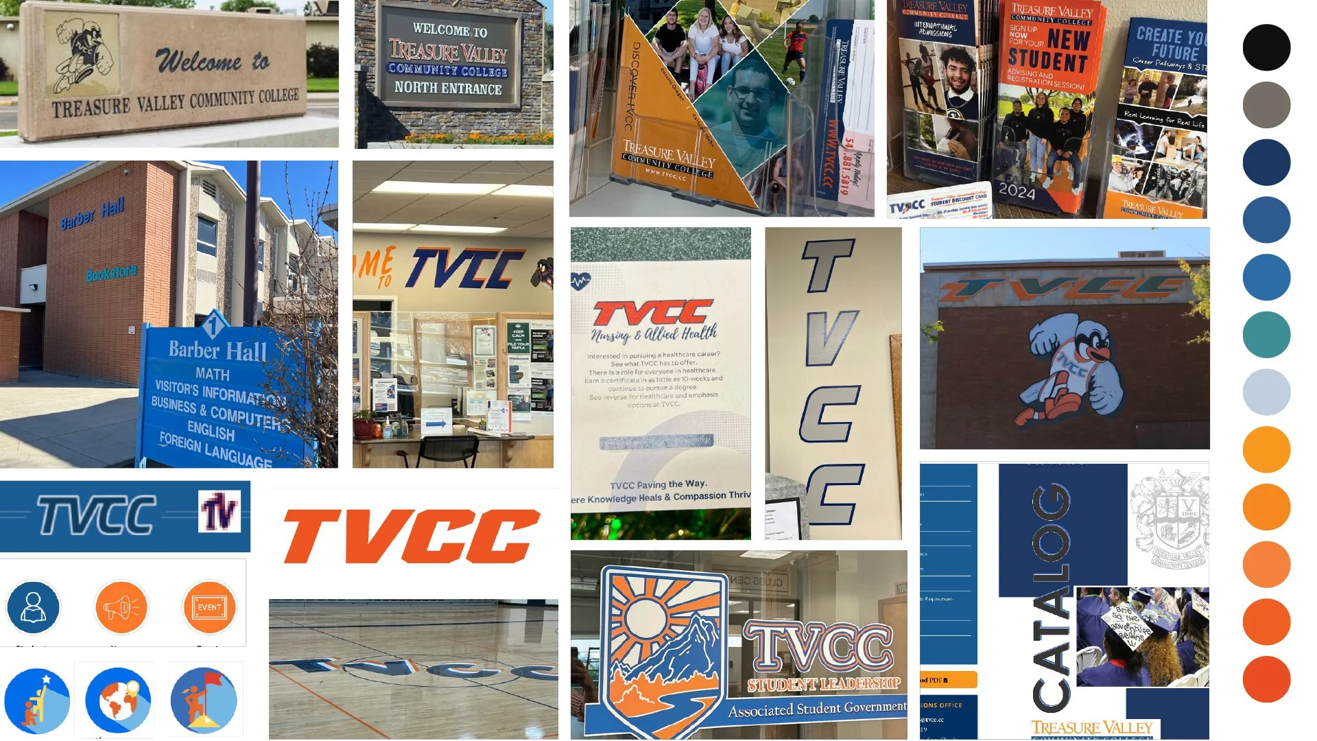
Our audit of TVCC’s existing visual brand showed consistency and opportunities for differentiation and modernization. The college’s beloved Chukar mascot illustration had been commission and completed in the mid-90s.
Throughout TVCC’s six plus decades, its brand identity had shifted and changed, often centered around a beloved athletic mascot, the Chukar. But in 2025, it was clear the college’s brand was no longer reflective of the future-oriented school TVCC had become. With branding that had been inconsistently applied throughout the years, and a mascot illustrated in the 90s, TVCC was ready for a bold brand identity that better represented its growth and investment in the community.
Striking a Balance
TVCC needed a fresh brand identity that built on their existing brand equity—particularly their well-known Chukar mascot—while signalling their renewed energy for the next 60 years of growth and community investment. Their new identity needed to balance institutional credibility alongside the energy and excitement of their athletics brand—underpinning their award-winning academic programs and a competitive athletic program.
For a regional icon like a public community college, community investment is also a key component for branding. TVCC and the community it serves have an interwoven relationship, both defining the other in terms of regional identity, shared purpose, and local pride. TVCC’s rebrand needed to strike the balance between new and exciting while staying connected to the community that built it.
The Approach: Protecting Brand Equity & Defining Brand Architecture
Before we built anything, we listened and learned. We began with an extensive discovery process that included early listening sessions with stakeholder groups across the college community, including faculty and staff, students, and administrators. We found early in the process that the college community was eager for a refreshed brand identity, and had valuable insights to share with us to shape our creative direction.
We then deployed a survey and analyzed nearly 400 unique responses from the wider community, including alumni and community members. This goldmine of information helped us confirm several key creative strategies, including color choices, doubling down on connection to place and history, and reinvigorating elements of the brand that held decades of equity.
This discovery, alongside our market analysis and stakeholder engagement, launched us into a year-long process of revision and refinement.
The Result: Ready for the Next 60 Years
We reinvisioned TVCC’s identity with deep ties to its rich history—and a fresh, rooted sense of progress for the next 60 years.
An Inspired Academic Brand Identity
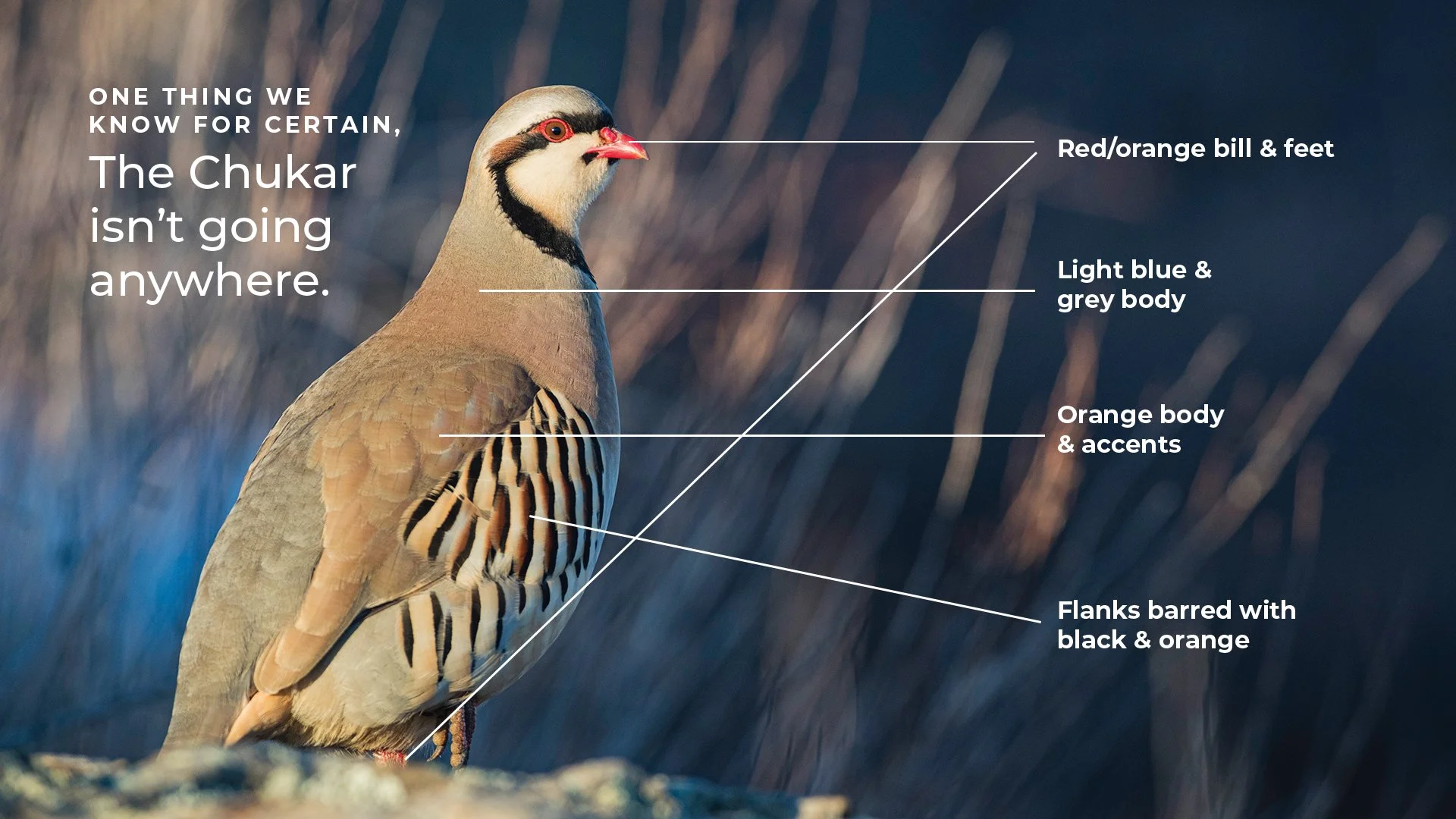
Our interviews, surveys, and listening sessions uncovered a key insight: the college’s well-loved athletics mascot was also its most widely-recognized brand element. The Chukar is a visually stunning bird right at home in the high desert Eastern Oregon landscape, and as one stakeholder expressed, “People don’t always know what a Chukar is… but they know it’s TVCC!”
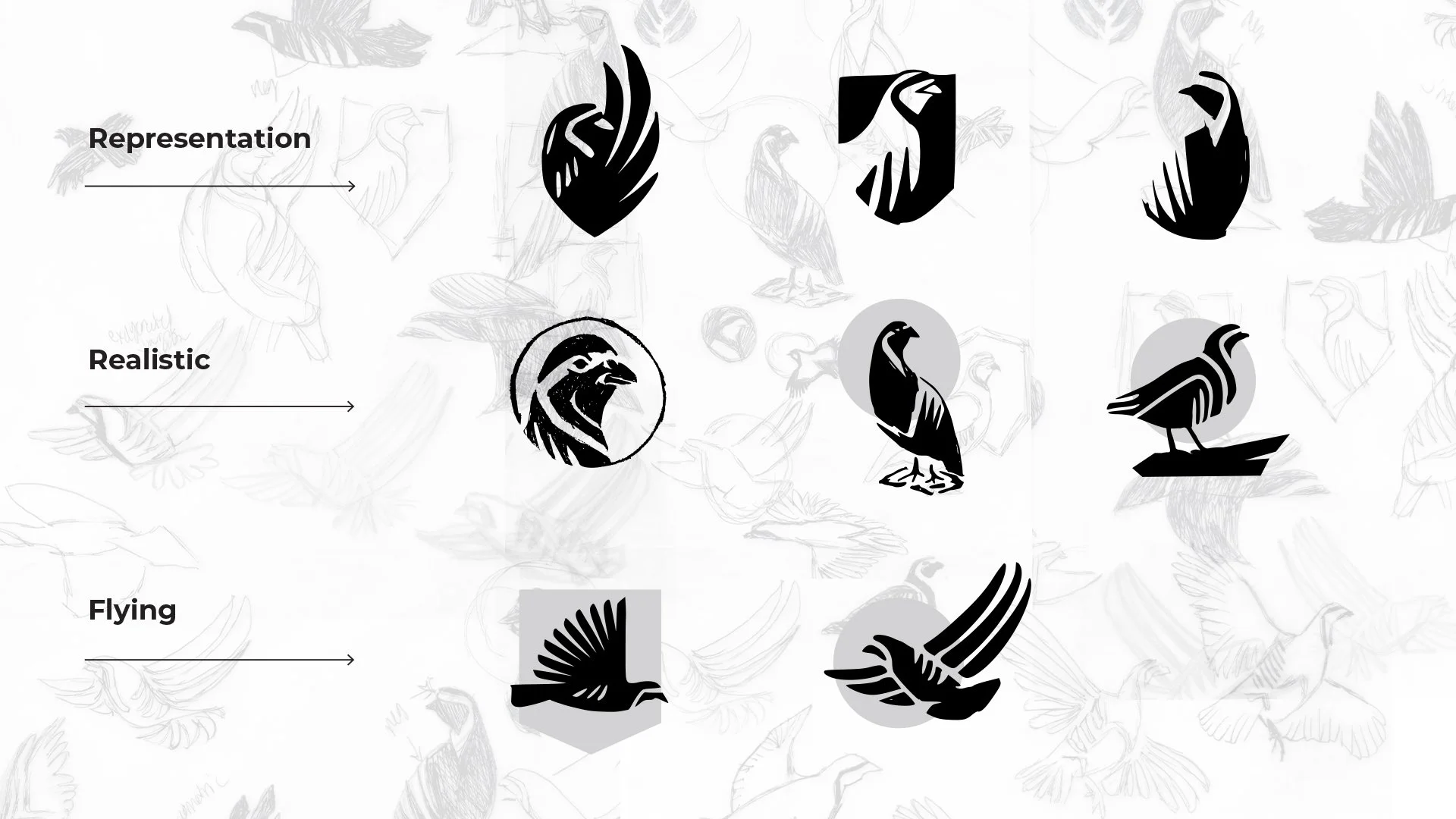
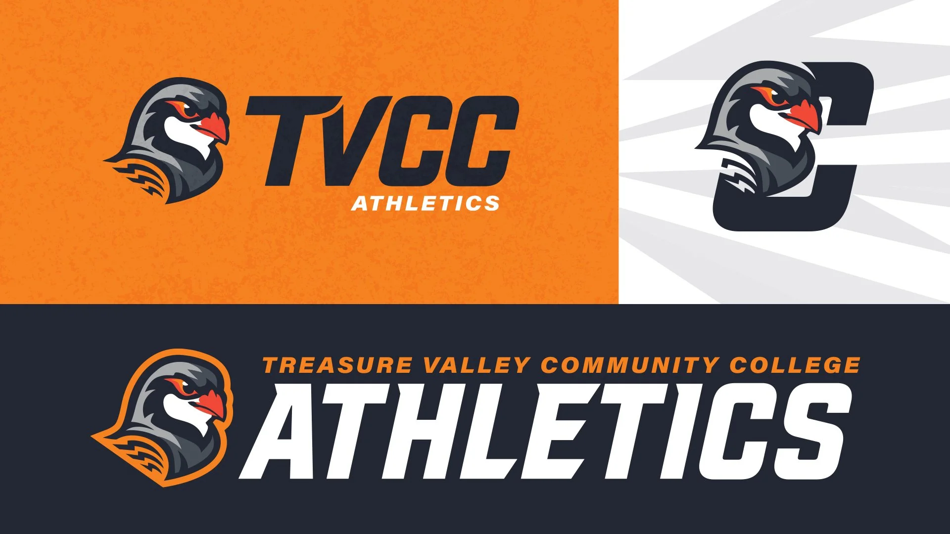
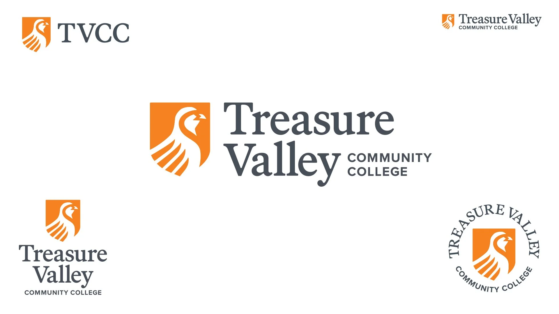
Armed with this insight, we built TVCC’s new logo around their mascot, using a distinctive illustration style to differentiate the academic brand from the athletics brand.
LOGO
Our Chukar icon is illustrated with bold, clean lines. Its forward-facing posture communicates future-orientation and community pride. Our shield evokes a sense of belonging and community.
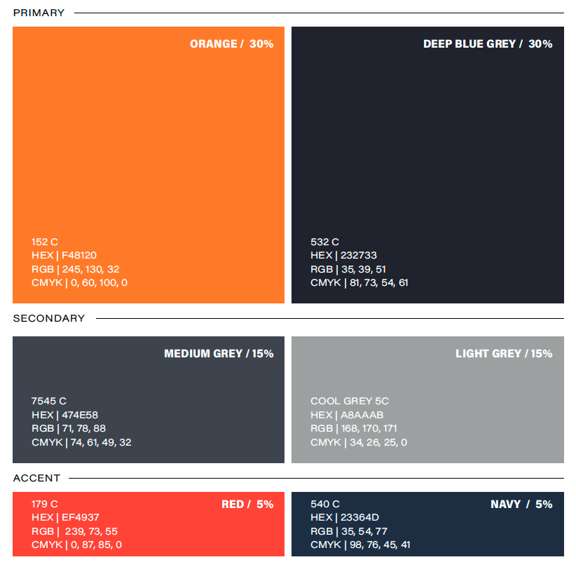
COLOR
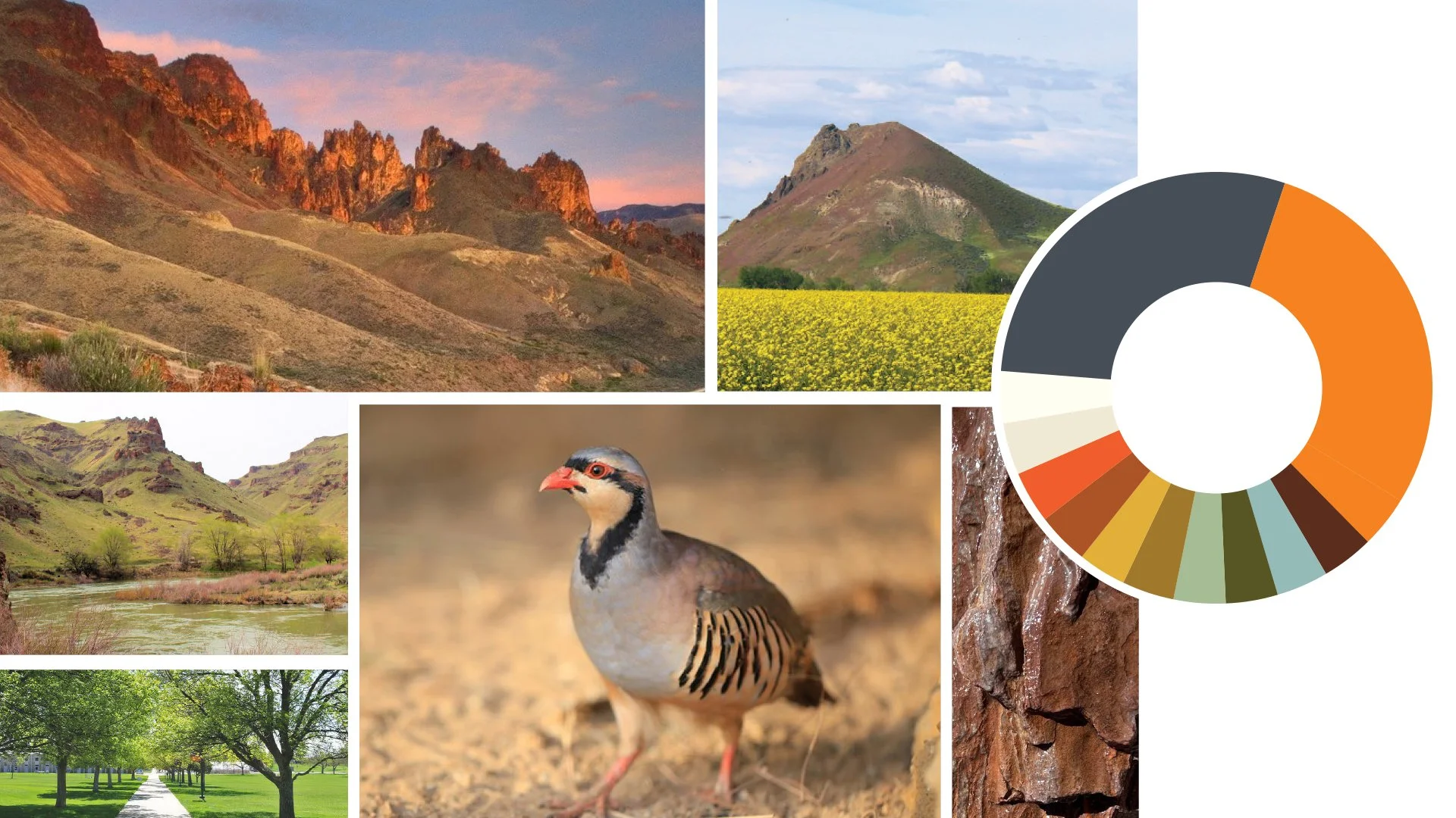
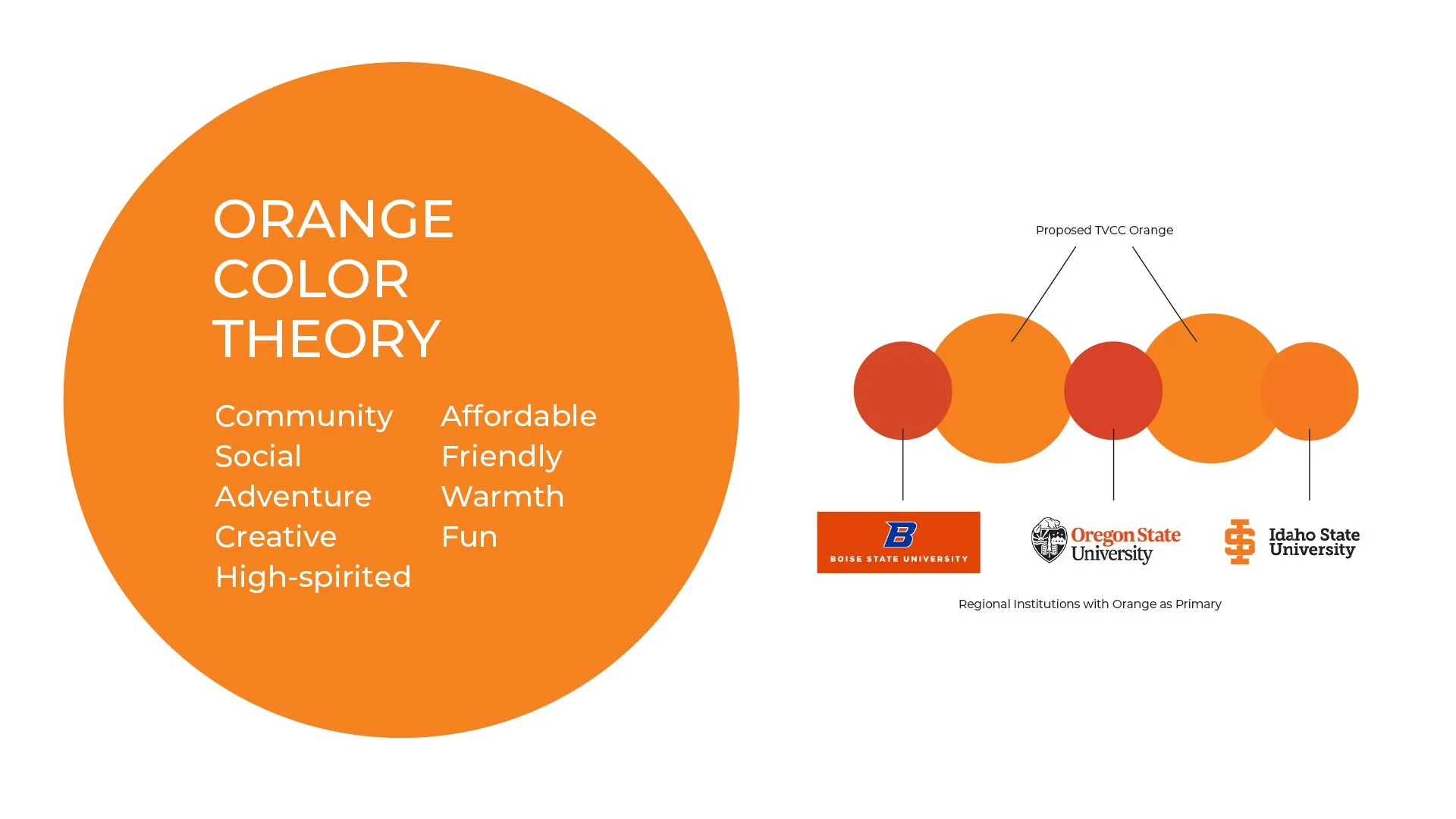
We preserved TVCC’s orange from previous brand identities, pairing it with colors inspired by the Eastern Oregon high desert landscape.

TYPOGRAPHY
A traditional serif font ownable to TVCC evokes academic excellence and decades of history; a clean san serif typeface brings legible, accessible grounding. We fully customized the type used in the college’s new wordmark, rounding the serif corners to balance the academic-forward font with friendly and approachable angles.
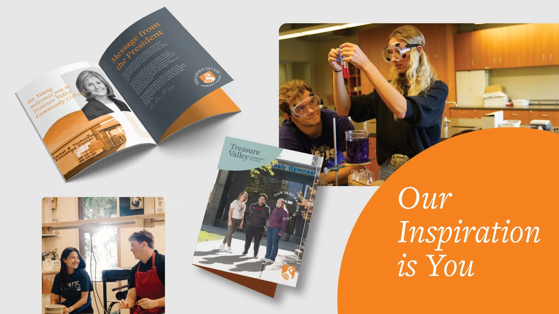
ICONOGRAPHY & GRAPHIC ELEMENTS
We found inspiration for TVCC’s institutional visual language in the beauty of the high desert landscape: sunbursts, contours, valleys, and other nature-driven symbols call back to the community TVCC serves. We also borrowed elements from the Chukar such as feather-like forms and stripe patterns.
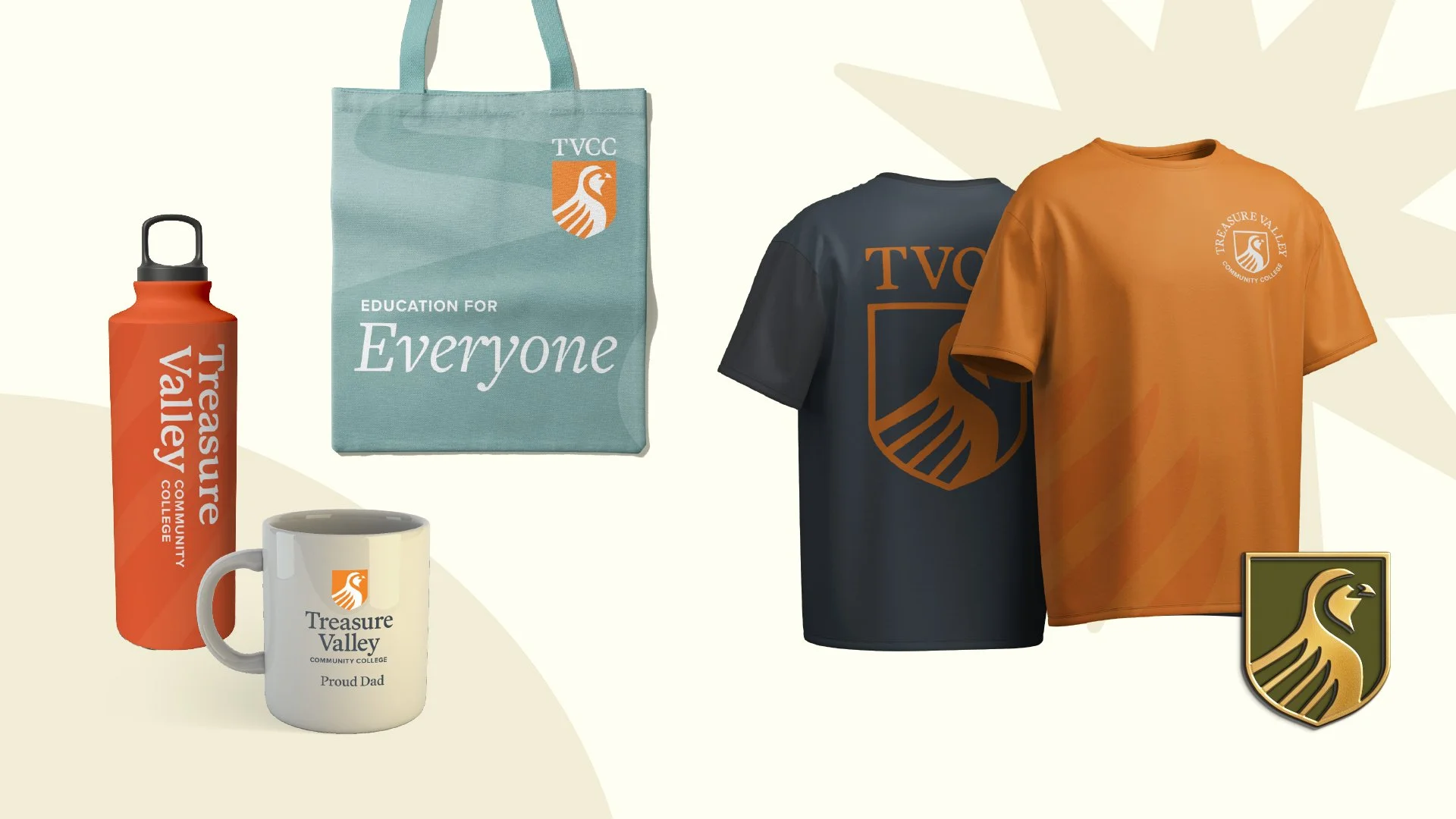


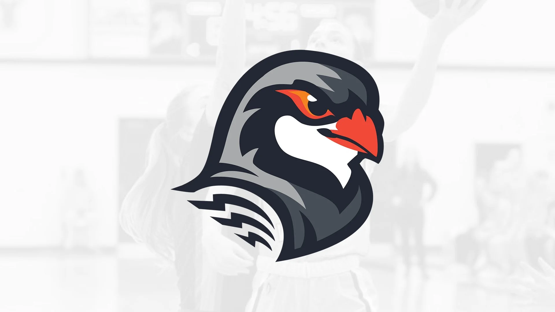
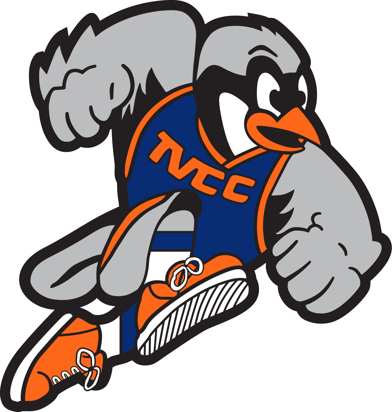
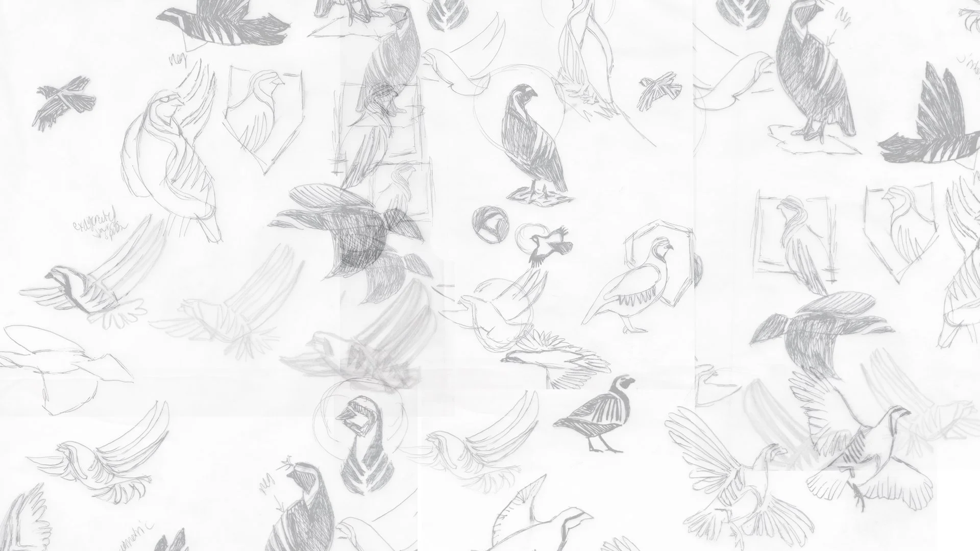
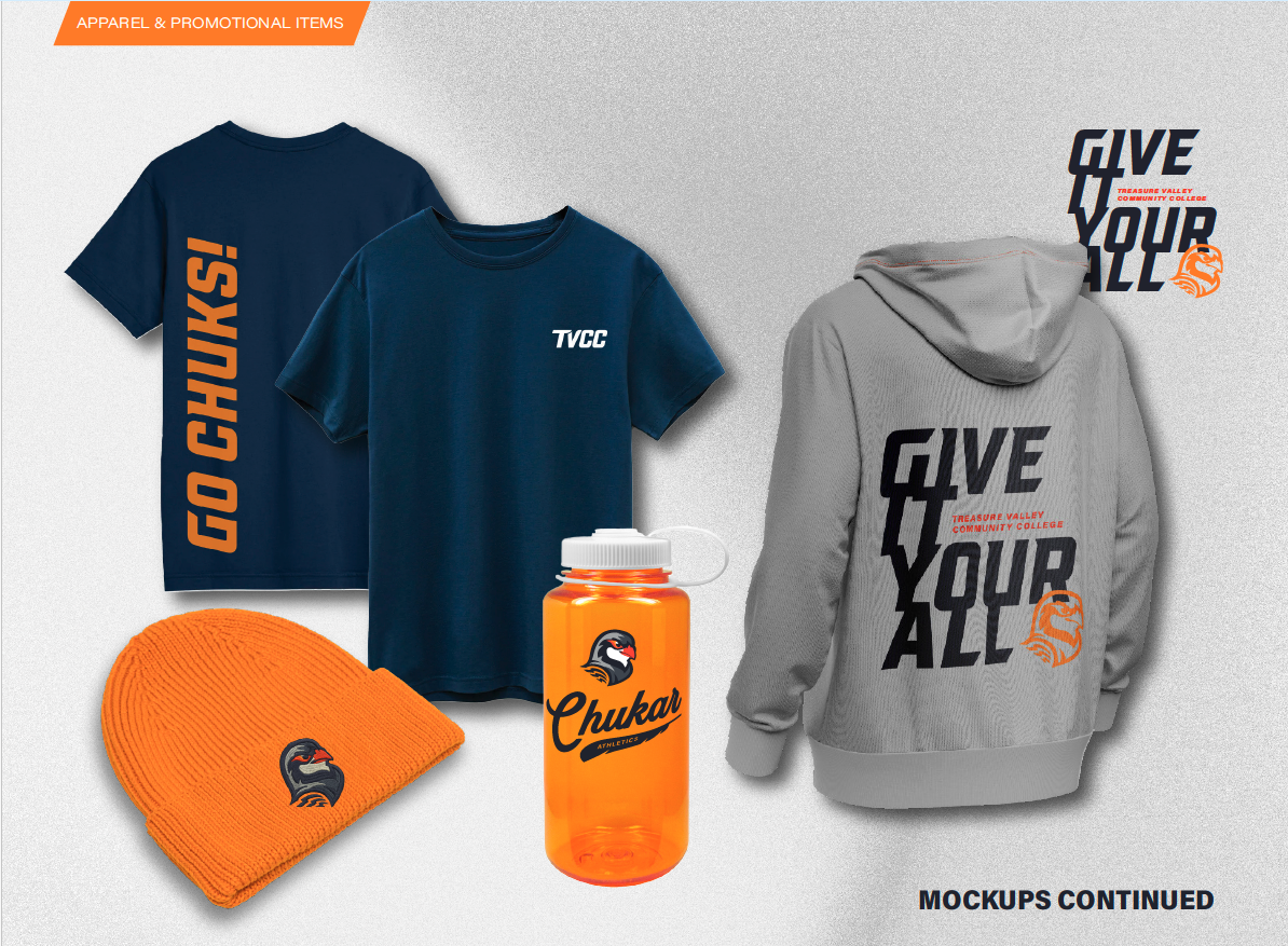
Ready to Fly: A Bold New Mascot
We heard two consistent messages about TVCC’s Chukar in our research phase: its current iteration leaned too cartoonish and lacked fierceness—and everyone loved the Chukar.
Student athletes, coaches, and the wider community alike agreed: the Chukar held decades of community pride and identity in its wings. But the lack of consistent application, alongside its cartoonish quality, also caused confusion—and worse, nobody knew the mascot’s name.

MEET CHUK THE TVCC MASCOT
We brought Chuk to life with bold lines, bright colors, and a strong sense of forward momentum. Chuk’s demeanor is forward-facing and fierce, sporting the bird’s distinctive red-orange beak, iconic stripes, and black bandit mask.
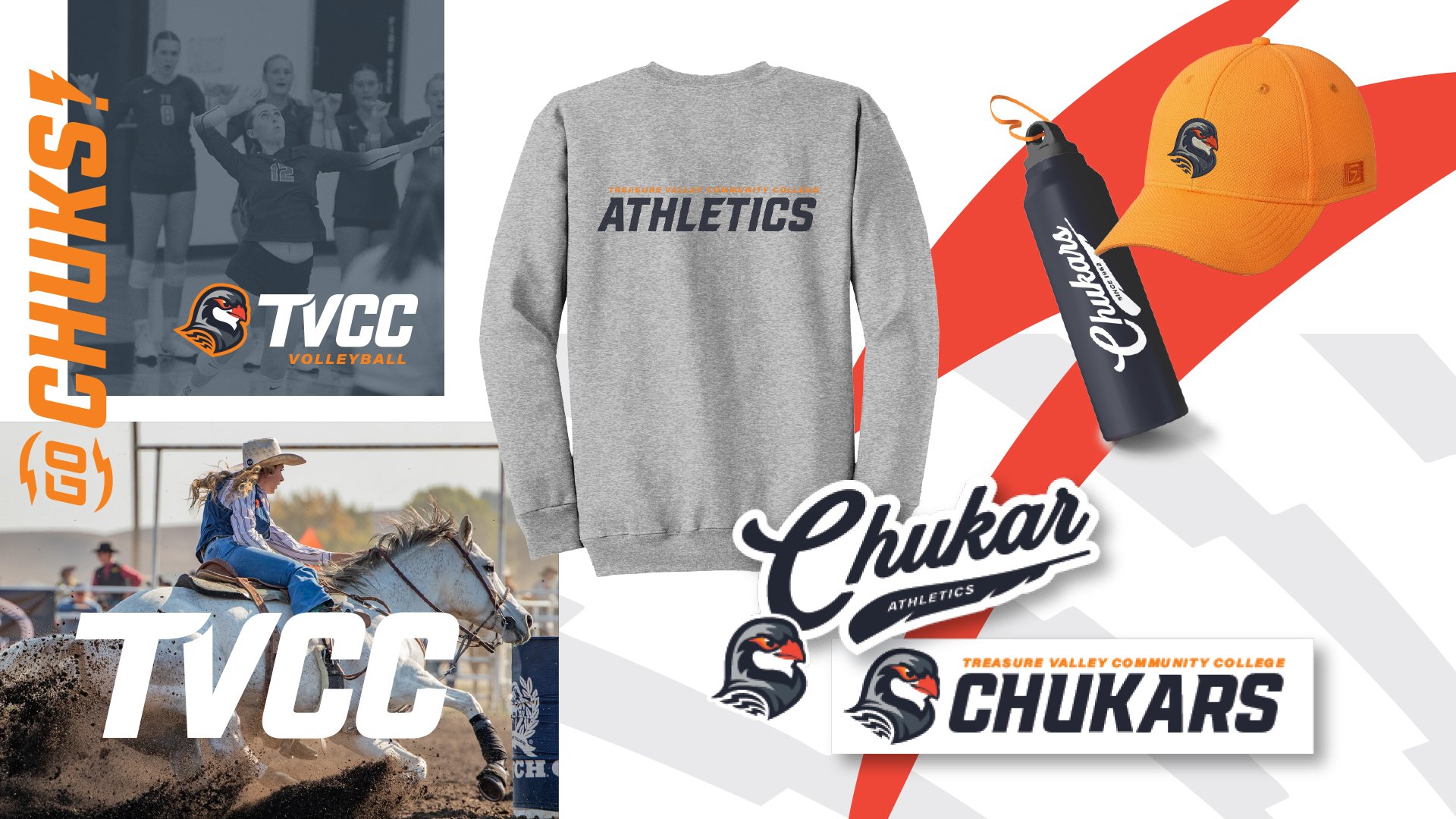
COLOR
The TVCC athletics program can now draw from a palette of colors that both nod to their long history as well as signal competitive strength for the future.
TYPOGRAPHY
We chose an athletic oblique block style that’s iconic in the world of American college sports, customized for TVCC. The font’s bold lines are impactful and pair well with the mascot illustration, further suggesting the Chukar’s speed and agility.

ICONOGRAPHY & GRAPHIC ELEMENTS
We incorporated the Chukar’s natural habitat, alongside its iconic lightning bolt-like stripes, into the athletic brand’s visual identity.

For the Community
Our work with TVCC brought new life to a familiar community pillar, bringing clarity, direction, and ownable identity to a beloved institution. By identifying key elements to preserve, alongside uncovering differentiators and strengths, we were able to provide the college with an inspiring new brand—one that’s ready for the next 60 years of community investment.
“Fisk Brand & Copy have been an outstanding partner in our college’s rebranding effort. Their team took the time to truly understand our organization and culture, and they approached every step with professionalism and genuine curiosity. They were easy to work with, consistently accommodating, and highly effective at facilitating stakeholder feedback in a way that brought meaningful insights to the project.
Throughout the process, deliverables were timely, responsive, and they were committed to producing work that reflected our college's mission. Their thoughtful guidance and collaborative approach made the experience smooth and productive, and we are grateful for the quality and care they brought to our rebrand.” - Travis McFetridge, TVCC Vice President of Student Services